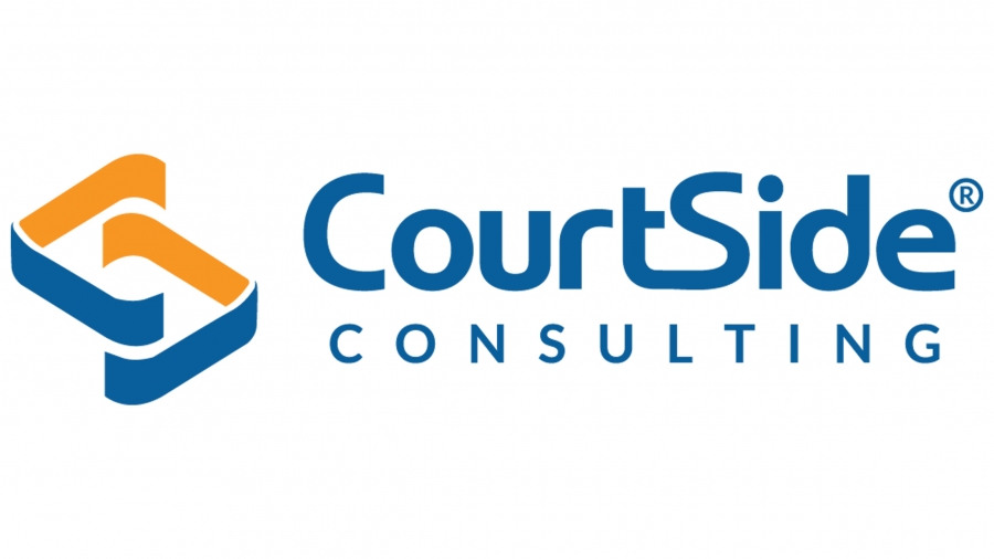
The Design Concept - Logo

CourtSide's old logo had little connection with its name, which potentially would create disconnection with the company and its service. In order to change that, the FiG team extracted the elements from the company's name - C and S. The broken square shape is the combination of the letter C and letter S. It also looks like a maze, which represents the benefit of CourtSide's consulting service: helping clients navigate HR management.
The Color - Orange and Blue
The FiG team continued the color theme of orange and blue in the design, but changed it to more bright and opposite colors. When using opposite colors, a design can often create tension which generates a certain degree of excitement and attention.

The Business Card
Business card along with other brand materials is one of the most important presentations of a company's identity. With the new logo in mind, the FiG team utilized the shape and color of CourtSide's logo and created something unique to extend the new brand identity to their business card.
Do you need a brand identity for your company? Contact FiG to get a great one!